-
Architects: Design Delivery Unit, Make Architects
- Area: 12291 m²
- Year: 2019
-
Manufacturers: Cheshire Wellness, Deba, Ergonorm, Focchi, Otis, Rainsford
-
Lead Architect: Neal Morgan-Collins
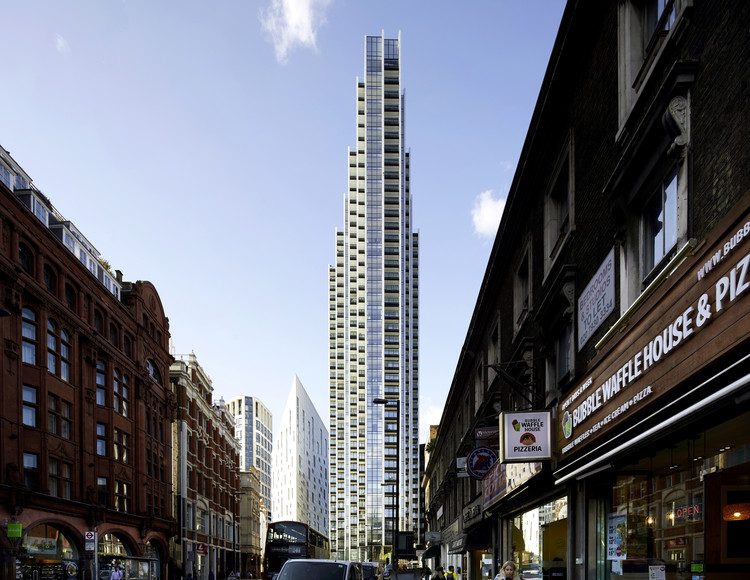
Text description provided by the architects. The buildings sit above London Underground and Thameslink lines. The tower delivers 302 apartments with leisure and spa facilities and basement parking. Whilst the commercial building is occupied by WeWork and provides access to three roof terraces, with external green walls. Over 35% of the footprint is a new public realm; with a landscaped piazza of shops and cafés created between the two buildings, providing a new pedestrian link between City Road and East Road.
The architecture clearly responds to the building’s urban context and maximises the potential of the site and location. A series of 12 vertical blades articulate the elevations and work together to compose the tower’s striking façade. Contrasting elevations have been created with more solid anodised aluminium façades with punched windows to the east and west contrasting with the predominantly glazed elements of the north and south elevations which capture the views and maximise natural light.
The blades are connected by glazed infills which provide floor-to-ceiling windows and ensure all residents have private outdoor space. As the cladding reaches the ground the level of transparency increases, offering more active frontage at the ground floor. This together with the creation of a double-volume space at the front southern tip, imbues the building with a sense of lightness.
The building accommodates a range of apartment types each with open-plan living and dual aspect views. All with generous balconies with roof terraces for apartments at the penthouse level that sit within the tapered roof as the blades descend.
The building has a cantilevered structure due to the below-ground constraints of the underground and Thameslink lines, which cross at the southern tip of the site. This discovery at Planning stage changed the concept for the structural strategy, resulting in the creation of a new superstructure design to prevent the building from twisting and leaning. Impacting upon all consented internal layouts. Large shear walls had to be introduced and the core redesigned with column locations and sizes altered. Whilst the façade concept was maintained, it was carefully deconstructed and redrawn to suit the new layouts, with the original architectural language safeguarded.
Loads imposed by the tower are kept clear of these tunnels by cantilevering the structure over the subterranean Victorian engineering. Giant beams supporting the cantilevered section of the tower are hidden below ground in the tower’s basement; these transfer loads from the cantilevered perimeter to a strengthened section of the central concrete core.
The mass provided by the frame (and by increasing the thickness of the ground floor slab and the mezzanine first-floor slab) helped give the structure sufficient inertia to dampen the ground-borne vibrations from the underground trains. The delivered tower respects the original design intent, to create a stunning addition to the London skyline and contributes to the regeneration of this part of the capital.